
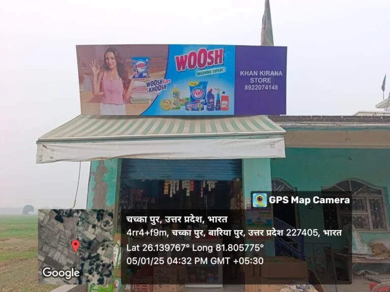
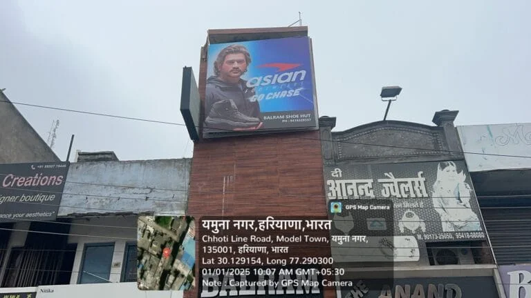
Dealer Boards: In a fast-paced city like Delhi, where vibrant markets and urban chaos coexist, capturing attention is both an art and a science. And in this visually noisy landscape, your dealer boards often become the first—and sometimes only—brand interaction a potential customer experiences. Whether you’re running a neighborhood hardware shop or a multi-outlet retail chain, your dealer boards are your silent salesperson—visible 24/7, communicating your presence, your purpose, and your promise.
Yet many businesses overlook the critical role that good design plays in outdoor advertising. A poorly designed dealer board doesn’t just go unnoticed—it actively harms your brand image. From unreadable fonts to off-brand colors, the smallest design missteps can make a huge difference in how customers perceive your business.
Let’s explore the six most common mistakes businesses make when designing dealer boards—and how to fix them to create maximum impact and recall in a crowded market.
Table of Contents
✅ 1. Overloading the Design: Confusion Over Clarity
Mistake: Trying to include every product, service, or message in one single board. The result? A cluttered, messy layout that overwhelms rather than attracts.
Why it hurts: People passing by only have a few seconds to register your message. A dealer board that tries to say everything usually ends up saying nothing.
What to do instead:
- Focus on one clear message or USP.
- Use minimal text, a striking headline, and a visual hierarchy to lead the eye.
- Include your logo prominently and a call-to-action if necessary (e.g., “Visit Today” or “Call Now”).
- Leave white space—it helps your key message breathe.
✅ 2. Using Unreadable Fonts or Improper Font Sizes
Mistake: Choosing fonts that are too small, too decorative, or simply not suited for outdoor visibility.
Why it hurts: If someone can’t read your dealer boards from a distance or in motion (e.g., from a moving vehicle), you’ve already lost a customer.
Fix it by:
- Choosing bold, sans-serif fonts like Arial, Helvetica, or Montserrat.
- Testing your design from different distances and angles before printing.
- Prioritizing legibility over aesthetics.
✅ 3. Poor Color Choices and Lack of Contrast
Mistake: Using colors that either clash too harshly or blend into the background, making your board invisible in its real environment.
Why it hurts: Low-contrast text and background combinations reduce visibility, especially in bright sunlight or under poor lighting.
- Choose high-contrast color combos like white on blue, yellow on black, or red on white.
- Consider the surrounding environment—walls, signage, daylight, street lighting—when selecting colors.
- Keep brand colors intact but adapt contrast for outdoor readability.
✅ 4. Inconsistent Branding Across Your Assets
Mistake: Designing dealer boards that look disconnected from your overall branding—different logos, fonts, colors, or tone.
Why it hurts: Inconsistent branding confuses customers and dilutes your professional image. It affects trust and long-term brand recall.
The solution:
- Use your official brand colors and logo consistently.
- Match fonts and messaging tone with your website, product packaging, and other marketing assets.
- Think of your dealer boards as an extension of your brand story, not a standalone design piece.
✅ 5. Wrong Size or Material for the Location
Mistake: Installing a dealer board that’s either too small to notice or too big to fit correctly, or choosing materials that don’t suit the environment.
Why it hurts: A board that’s hidden, obstructed, or quickly worn out by weather is a waste of investment.
Avoid this by:
- Conducting a site assessment before finalizing the size and material.
- For outdoor dealer boards, use weather-resistant materials like ACP sheets or UV-resistant vinyl.
- For indoor placements, opt for lightweight, high-quality printed foam boards or LED-lit panels for a modern look.
✅ 6. Ignoring the Local Audience and Cultural Relevance
Mistake: Designing a dealer boards that doesn’t connect with the neighborhood audience—be it language, tone, visuals, or cultural relevance.
Why it hurts: If your message doesn’t resonate with the locals, it will be ignored. Worse, it might feel tone-deaf or out of place.
Stay relevant by:
- Using local language and familiar expressions.
- Adding cultural elements (e.g., festive themes, local icons) when appropriate.
- Understanding your audience’s preferences in colors, visuals, and tone.
Your Dealer Board Is an Investment—Design It Right
A well-designed dealer board isn’t just about aesthetics—it’s about effectiveness. It’s your round-the-clock ambassador, your local brand presence, and often the deciding factor for a potential customer walking into your store.
In a bustling city like Delhi, where customers are bombarded with advertisements at every corner, standing out takes more than just signage—it takes smart, thoughtful design rooted in local insight and brand consistency.
🚀 ACME Advertising Co. — Experts in Local Dealer Boards Advertising in Delhi
With decades of experience in outdoor branding, ACME Advertising Co. understands the local markets, cultural nuances, and visual dynamics of Delhi like no one else. From design to fabrication to installation, we deliver dealer boards that drive traffic, build trust, and create brand recall—exactly where it matters.
📞 Contact us today www.acmeadvertising.co for customized solutions.
Let your dealer board do more than just display—let it sell.